Theme
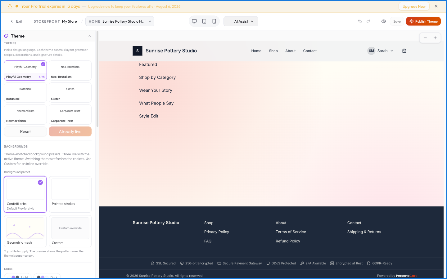
The Theme is the look and feel of your whole storefront: colors, fonts, button styles, header layout, branding, and spacing. You set it in the Theme Editor, which shows a live preview so you see every change before it goes live.
Where to find it
Sidebar → STOREFRONT → Storefronts → Theme.
How it's organized
The editor is two panes. On the left, a settings panel with tabs — Style, Type (typography), Behavior, Nav (navigation), Brand (branding), and Layout. On the right, a full preview of your storefront that re-renders the moment you change anything. There's a lot here — every control is documented in the Editor's theme reference.
What happens — and what doesn't
- Changes preview live but only go public when you publish — experiment freely.
- The theme applies to the whole storefront, so a color or font change ripples across every page at once.
- Each storefront has its own theme; a holiday storefront can look completely different from your everyday one.
- Presets give you a starting look; from there every value is adjustable.
Does changing my theme affect the live store right away?
No. Theme changes show in the live preview instantly but only reach customers when you publish. You can tweak as much as you like first.
Where do I change fonts and colors?
In the Theme Editor's tabs — Style for colors and surfaces, Type for fonts. Every control is catalogued in the Editor's theme controls reference.
Can two storefronts have different themes?
Yes. Theme is per storefront, so each store version you run can look entirely different.
Every theme control
The theme is your store's look in one place — change something here and it applies to every page at once. These are all 149 controls, grouped the way the editor groups them.
Style
Colours, borders, shadows and corner radius — the surface look of everything.
| Group | Control | Options | What it does |
|---|---|---|---|
| Themes | Theme: Playful Geometry | 1 of 6 themes | A complete preset — colours, fonts, corners and motion in one click. Picking it replaces your current look, and you can adjust anything afterwards. |
| Themes | Theme: Neo-Brutalism | 1 of 6 themes | A complete preset — colours, fonts, corners and motion in one click. Picking it replaces your current look, and you can adjust anything afterwards. |
| Themes | Theme: Botanical | 1 of 6 themes | A complete preset — colours, fonts, corners and motion in one click. Picking it replaces your current look, and you can adjust anything afterwards. |
| Themes | Theme: Sketch | 1 of 6 themes | A complete preset — colours, fonts, corners and motion in one click. Picking it replaces your current look, and you can adjust anything afterwards. |
| Themes | Theme: Neumorphism | 1 of 6 themes | A complete preset — colours, fonts, corners and motion in one click. Picking it replaces your current look, and you can adjust anything afterwards. |
| Themes | Theme: Corporate Trust | 1 of 6 themes | A complete preset — colours, fonts, corners and motion in one click. Picking it replaces your current look, and you can adjust anything afterwards. |
| Themes | Apply theme button | action (commit selected theme LIVE) | Commits the theme you have previewed. Nothing changes for buyers until you apply. |
| Themes | Reset theme button | action (clear creator color/font customisations) | Returns everything to the theme default, discarding your customisations. |
| Palette | Palettes browser | ~126 curated palettes (fetchAllPalettes, dynamic count) | Ready-made colour sets. Picking one rewrites your primary, accent and background together, so the store stays coherent instead of becoming three unrelated choices. |
| Palette | My Palettes group | creator's saved palettes (theme_variants, tenant-scoped) | Palettes you have saved yourself. |
| Palette | Save as custom palette button | action (create theme_variant) | Keeps the colours you've landed on as a named set, so you can return to it after experimenting. |
| Colors | Primary color well | hex color | Your main brand colour. It drives buttons, links and anything the store wants you to click — so it needs to stand out against your background, not blend into it. |
| Colors | Accent color well | hex color | A second colour for highlights and badges. Used sparingly; if it competes with the primary, nothing reads as the main action. |
| Colors | Background color well | hex color | The page behind everything. Small shifts here matter more than they look — a warm off-white and a cool grey give the same store two different characters. |
| Colors | Surface color well | hex color | Cards, panels and anything raised off the page background. A slight difference from the background is what makes a card read as a card. |
| Colors | Text color well | hex color | The colour of body copy. Contrast against the background is what makes a store readable on a phone in daylight. |
| Colors | Text Muted color well | hex color | Secondary text — captions, timestamps, helper lines. Quieter than body copy but still legible. |
| Colors | Border color well | hex color | The lines around cards, inputs and dividers. Lower contrast reads calmer; higher contrast reads more structured. |
| Colors | Section Bold color well | hex color | The background for sections you want to stand out from the rest of the page. |
| Background | Background slot 1 | slot 1/2/3 | A background layer — a colour, gradient or image. Layers stack, so a later slot sits over an earlier one. |
| Background | Background slot 2 | slot 1/2/3 | A background layer — a colour, gradient or image. Layers stack, so a later slot sits over an earlier one. |
| Background | Background slot 3 | slot 1/2/3 | A background layer — a colour, gradient or image. Layers stack, so a later slot sits over an earlier one. |
| Background | Background custom: None | 8 pattern types | A plain background — just the colour. The safest choice when your products are the visual interest. |
| Background | Background custom: Solid | 8 pattern types | A single flat colour. |
| Background | Background custom: Dot Grid | 8 pattern types | A faint grid of dots. Adds texture without competing with content. |
| Background | Background custom: Halftone | 8 pattern types | A printed-dot pattern. Distinctive, and heavy — best behind a single hero section rather than a whole page. |
| Background | Background custom: Paper Grain | 8 pattern types | A subtle paper texture — warms up an otherwise flat page. |
| Background | Background custom: Ambient Orbs | 8 pattern types | Soft coloured glows behind the content. Reads modern and can wash out text if the contrast drops. |
| Background | Background custom: Grid Paper | 8 pattern types | Faint ruled lines, like graph paper. |
| Background | Background custom: Animated | 8 pattern types | A moving background. Costs performance on older phones and pulls the eye away from your products. |
30 controls in this group. Generated from the live theme-control matrix.
Layout
Widths, spacing and how content sits on the page.
| Group | Control | Options | What it does |
|---|---|---|---|
| Density | Page Density | compact | The overall breathing room. Comfortable gives everything space; compact fits more above the fold — useful for a large catalogue, tiring for a landing page. |
| Density | Page Density | default | The overall breathing room. Comfortable gives everything space; compact fits more above the fold — useful for a large catalogue, tiring for a landing page. |
| Density | Page Density | spacious | The overall breathing room. Comfortable gives everything space; compact fits more above the fold — useful for a large catalogue, tiring for a landing page. |
| Corner Roundness | Border Radius (global) | none | How rounded corners are, everywhere at once. Sharp corners read technical and serious; heavy rounding reads friendly and consumer. |
| Corner Roundness | Border Radius (global) | sm | How rounded corners are, everywhere at once. Sharp corners read technical and serious; heavy rounding reads friendly and consumer. |
| Corner Roundness | Border Radius (global) | md | How rounded corners are, everywhere at once. Sharp corners read technical and serious; heavy rounding reads friendly and consumer. |
| Corner Roundness | Border Radius (global) | lg | How rounded corners are, everywhere at once. Sharp corners read technical and serious; heavy rounding reads friendly and consumer. |
| Corner Roundness | Border Radius (global) | full | How rounded corners are, everywhere at once. Sharp corners read technical and serious; heavy rounding reads friendly and consumer. |
| Section Spacing | Section Spacing | tight | The gap between one section and the next. This is what makes a page feel considered rather than crammed. |
| Section Spacing | Section Spacing | default | The gap between one section and the next. This is what makes a page feel considered rather than crammed. |
| Section Spacing | Section Spacing | loose | The gap between one section and the next. This is what makes a page feel considered rather than crammed. |
| Page Width | Page Width | narrow | How wide your content runs. Narrow keeps lines short and readable for text-led stores; full-width suits image-heavy catalogues but makes paragraphs hard to track. |
| Page Width | Page Width | boxed | How wide your content runs. Narrow keeps lines short and readable for text-led stores; full-width suits image-heavy catalogues but makes paragraphs hard to track. |
| Page Width | Page Width | wide | How wide your content runs. Narrow keeps lines short and readable for text-led stores; full-width suits image-heavy catalogues but makes paragraphs hard to track. |
| Page Width | Page Width | extra | How wide your content runs. Narrow keeps lines short and readable for text-led stores; full-width suits image-heavy catalogues but makes paragraphs hard to track. |
| Page Width | Page Width | full | How wide your content runs. Narrow keeps lines short and readable for text-led stores; full-width suits image-heavy catalogues but makes paragraphs hard to track. |
| Cards | Card Padding | Slider 8–48 px, step 4, default 24 | Space inside a card, between its border and its contents. Too little and the card feels cramped whatever else you fix. |
| Cards | Card Gap | Slider 8–40 px, step 4, default 20 | The gap between cards in a grid. Wider gaps make each card read as its own thing; tighter gaps make them read as one block. |
| Custom CSS | Custom CSS | Textarea, sliced to 10000 chars | An escape hatch for anything the controls don't cover. It applies after everything else, so it can override the theme — and can break your storefront if the selectors are wrong. Reach for it last. |
19 controls in this group. Generated from the live theme-control matrix.
Typography
Fonts, sizes, weights and line spacing.
| Group | Control | Options | What it does |
|---|---|---|---|
| Fonts | Heading font family | font picker (customFonts + curatedFonts, ~22 curated grouped by category) | The font for headlines. This carries most of your store's personality — it's the first thing a visitor reads and the thing they remember. |
| Fonts | Body font family | font picker (customFonts + curatedFonts, ~22) | The font for everything people actually read. Choose for legibility at small sizes before character; a beautiful body font that's hard to read costs you sales. |
| Fonts | Display / accent font | font picker + "none" = inherit from heading | An optional third font for hero text and pull quotes. Used anywhere else it starts to look busy. |
| Fonts | Custom font upload | file upload .woff2/.woff/.ttf/.otf | Upload a licensed font of your own. Check your licence covers web use before you do. |
| Weight | Heading weight | 300/400/500/600/700/800/900 (7 toggle buttons) | How heavy headlines are. Heavier reads more confident and more commercial; lighter reads more editorial. |
| Weight | Body weight | 300/400/500/600 (4 toggle buttons) | The weight of running text. Too heavy tires the eye over a long page. |
| Spacing | Heading letter spacing | -0.03em / -0.02em / -0.01em / 0 / 0.02em / 0.04em / 0.06em (7 toggle buttons) | The gap between letters in headings. Tightening slightly makes large headlines look deliberate; loosening suits small uppercase labels. |
| Transform | Heading text transform | none / uppercase / capitalize (3 toggle buttons) | Whether headings render as typed, ALL CAPS, or Title Case. Caps suit short labels and get shouty over a full sentence. |
| Scale | Type scale ratio | 1.25 Compact / 1.333 Classic / 1.414 Bold / 1.618 Golden (4 toggle buttons) | How much bigger each heading level is than the one below it. A small ratio reads calm and editorial; a large one gives dramatic headlines and can crowd a phone screen. |
9 controls in this group. Generated from the live theme-control matrix.
Header
Your store's top bar — its layout, behaviour and contents.
| Group | Control | Options | What it does |
|---|---|---|---|
| Header Menu | Header Menu | select (menu id, location=header) | Which of your menus the header uses. Menus themselves are built under Storefront → Menus. |
| Identity | Show Logo | toggle on/off | Whether your logo appears at all. Off suits stores whose name is the wordmark. |
| Identity | Logo Size | compact/default/large | How large the logo renders. Bigger asserts the brand; too big pushes the menu into a cramped second row on mobile. |
| Identity | Logo Shape | none/rounded/circle | Whether the logo is masked to a circle, a rounded square, or left as-is. |
| Identity | Logo Upload | image url | Your logo file. Upload it at twice the size you want it displayed so it stays sharp on high-resolution screens. |
| Identity | Show Brand Name | toggle on/off | Whether your store name appears as text beside the logo. Useful when the logo is a symbol nobody would read as your name. |
| Identity | Brand Name | free-text | The name shown in the header, if it differs from your store name. |
| Identity | Brand Name Font | __heading__ (same as heading) or curatedFonts | A font for the brand name specifically, when it should differ from your headings. |
| Identity | Brand Name Color | hex color (picker + free-text) | The brand name colour, when it needs to differ from the header text. |
| Identity | Show Tagline | toggle on/off | A short line under the brand name. Say what you sell — a visitor decides in seconds whether they are in the right place. |
| Identity | Tagline | free-text (maxLength 160) | The tagline text itself. |
| Identity | Favicon | image url | The small icon in the browser tab and in bookmarks. It renders at 16px, so anything detailed becomes a smudge — use a mark, not your full logo. |
| Layout | Header Layout | logo-left/logo-center/logo-above | Where the logo and menu sit relative to each other. Centred logos read boutique; left-aligned reads conventional and scans faster. |
| Layout | Header Elevation | flat/soft/strong/floating | Whether the header sits flat on the page or lifts off it with a shadow. Elevation helps when content scrolls underneath. |
| Layout | Sticky Header | toggle on/off | Keeps the header visible as people scroll. Useful on long pages; it costs vertical space on a phone. |
| Layout | Header Link Style | underline/color-only/underline-on-hover | How header links are drawn — plain, underlined, or as buttons. |
| Menu | Menu Alignment | left/center/right | Where navigation items sit in the header — beside the logo, or pushed to the far edge. |
| Menu | Menu Density | compact/normal/spacious | The spacing between menu items. Tighter fits more links before they collapse into the mobile menu. |
| Menu | Menu Weight | 400/600 (regular/bold) | How bold navigation text is. |
| Menu | Menu Hover Style | color-shift/background-fade/underline-slide | What a menu item does when hovered — underline, highlight, or colour change. |
| Menu | Nav Active Indicator | color/pill/bold/underline | How the current page is marked in the menu. Without one, visitors lose track of where they are. |
| Menu | Menu Text Color | hex color (picker + free-text) | The colour of navigation text, when it should differ from the header default. |
| Menu | Menu Hover/Active Color | hex color (picker + free-text) | The colour a menu item takes when hovered or when it is the current page. |
| Icons & Actions | Show Account Icon | toggle on/off | Whether buyers see a sign-in / account entry point in the header. Off makes sense only if you sell nothing that needs an account. |
| Icons & Actions | Ambient Background | toggle on/off | A soft gradient behind the header instead of a flat colour. |
| Icons & Actions | Header Background Color | hex color (picker + free-text) | The header's own background, when you want it different from the page. |
| Mobile | Drawer Side | left/right | Which edge the mobile menu slides in from. |
| Mobile | Mobile Menu Style | drawer/fullscreen | How navigation collapses on a phone — a slide-in drawer, or a full-screen overlay. |
28 controls in this group. Generated from the live theme-control matrix.
Footer
The bottom of every page.
| Group | Control | Options | What it does |
|---|---|---|---|
| Layout | Footer Menu | Select (menus filtered location=="footer") | Which menu the footer shows. Usually the longer one — footers are where policies and secondary links live. |
| Layout | Footer Columns | numeric display + navigate button (default 3) | How many columns the footer splits into. More columns suit a lot of links; fewer read cleaner. |
| Layout | Mobile Footer Layout | enum: columns | accordion | stack (default columns) | Whether footer columns stack or collapse into accordions on a phone. |
| Layout | Footer Link Style | enum: underline | color-only | underline-on-hover | The same choice for footer links. |
| Layout | Footer Background Color (swatch) | color input type=color (default surface/#FFFFFF) | A footer background different from the page. |
| Layout | Footer Background Color (hex text) | string Input font-mono | The footer background as a hex code. |
| Layout | Footer Background Color reset | button (sets undefined) | Returns the footer to the theme default. |
| Brand Column | Show Footer Logo | boolean Switch (default true) | Repeats your logo at the bottom of the page. |
| Brand Column | Show Footer Tagline | boolean Switch (default true) | A one-line description under the footer logo. |
| Brand Column | Show Footer Email | boolean Switch (default true) | Shows a contact email in the footer. Worth having — buyers look for it before they use a form. |
| Brand Column | Show Footer Phone | boolean Switch (default true) | A phone number in the footer. |
| Brand Column | Show Social Footer | boolean Switch | Your social links in the footer. |
| Newsletter | Show Newsletter Signup | boolean Switch (default on unless false) | Puts an email capture in the footer. The lowest-effort way to collect an audience from traffic that isn't ready to buy. |
| Newsletter | Newsletter Headline | string Input maxLength 120 | The prompt above the signup field. Say what they get, not "subscribe". |
| Newsletter | Newsletter Subtitle | string Input maxLength 200 | A supporting line under the headline. |
| Newsletter | Newsletter Button Label | string Input maxLength 40 | The signup button wording. "Get the list" converts better than "Submit". |
| Copyright | Copyright Override | string Input maxLength 200 | Replaces the automatic copyright line with your own wording. |
17 controls in this group. Generated from the live theme-control matrix.
Announcement bar
The strip above the header, when you're running one.
| Group | Control | Options | What it does |
|---|---|---|---|
| Enabled toggle | boolean Switch (default false) | Turns the strip above the header on. Best used for one thing at a time — a sale, a shipping cutoff. | |
| Text | string Input | What the bar says. Short enough to read at a glance on a phone. | |
| Link | string (LinkPicker component) | Where the bar goes when tapped. A bar that says something is happening but isn't clickable frustrates people. | |
| Background color (swatch) | color Input type=color (default #FACC15) | Pick the background colour visually. | |
| Background color (hex text) | string Input font-mono | The same background colour as a hex code, for matching an exact brand value. | |
| Text color (swatch) | color Input type=color (default #000000) | Pick the text colour visually. | |
| Text color (hex text) | string Input font-mono | The same text colour as a hex code. | |
| Text color reset | button (sets textColor undefined) | Returns text to the theme default, undoing a manual override. | |
| Dismissible toggle | boolean Switch (default true) | Lets visitors close the announcement bar. Without it, the bar takes space on every page for everyone. |
9 controls in this group. Generated from the live theme-control matrix.
Buttons, cards and inputs
The components buyers actually click and type into.
| Group | Control | Options | What it does |
|---|---|---|---|
| Button | Button shape | rounded (6px) / sharp (0px) / pill (999px) | Square, rounded or pill. Pills read consumer and friendly; squares read technical. |
| Button | Hover effect | darken / lift / scale / wiggle / fill-accent | What a button or card does when the pointer is over it. On a phone nobody sees this — keep the resting state readable on its own. |
| Button | Shadow | none / soft / soft-diffused / soft-hard / hard-offset | How much a button lifts off the page. |
| Button | Text style (text-transform) | none / uppercase / capitalize | Whether text renders as typed, uppercase, or title case. |
| Card | Card style | shadow / border / flat | Whether cards have a border, a shadow, or neither. Borderless cards need a background difference to read as separate. |
| Card | Card shadow | none / soft / soft-diffused / soft-hard / hard-offset | How much cards lift off the page. |
| Card | Hover effect | none / lift / wiggle / rotate | What a button or card does when the pointer is over it. On a phone nobody sees this — keep the resting state readable on its own. |
| Card | Product image shape (store-wide) | theme / rounded / square / circle / dome | Square, portrait or landscape crops for every product image. Consistency matters more than the choice — mixed shapes make a grid look untidy. |
| Input Style | bordered/underline/filled | How form fields look — outlined, filled, or underlined. Outlined is the safest for making a field look like a field. | |
| Input Focus | border-color/glow/float-label | What happens when someone taps into a field. A clear focus state is an accessibility requirement, not decoration. | |
| Image Hover | none/zoom/fade-overlay | What product images do on hover — zoom, lift, or nothing. |
11 controls in this group. Generated from the live theme-control matrix.
Product page
Controls specific to how a single product is presented.
| Group | Control | Options | What it does |
|---|---|---|---|
| Frequently Bought | Switch (default ON) | Shows products commonly bought alongside this one. | |
| Co-Purchase | Switch (default ON) | Suggestions based on what other buyers purchased together. | |
| Cross-Sell | Switch (default ON) | Related products you pick, rather than ones the system infers. | |
| Cross-Sell | Cross-Sell Heading | Text input, maxLength 80 | The wording above cross-sell products. "You might also like" outperforms "Related products". |
| Recently Viewed | Switch (default ON) | Shows products this visitor looked at earlier. | |
| Recently Viewed | Recently Viewed Heading | Text input, maxLength 80 | The wording above the recently-viewed row. |
| Share Button/Bar | Switch (default ON) | Share controls on product pages. | |
| Lightbox | Switch (default ON) | Whether tapping a product image opens it full-screen. Useful when detail sells the product. | |
| Breadcrumb | Switch (default ON) | Whether pages show a trail back to where they came from. Worth having on deep catalogues. | |
| Product Reviews | Switch (default ON) | Whether reviews appear on the product page. | |
| Reviews | Reviews Heading | Text input, maxLength 80 | The wording above customer reviews. |
11 controls in this group. Generated from the live theme-control matrix.
Motion and decoration
Animation and the decorative touches on top.
| Group | Control | Options | What it does |
|---|---|---|---|
| Transition Speed | enum: snappy(150ms) | default(250ms) | gentle(400ms) | How fast things move. Fast feels responsive; slow feels laboured, especially on repeat visits. | |
| Scroll Animation | enum: none | fade-up | slide-in | scale-up | Whether sections animate in as you scroll to them. Effective once, tiring on a long page. | |
| Motion Preset | Animation Style | 6 preset cards: subtle_elegant | energetic_bold | gentle_organic | snappy_modern | playful_bounce | dramatic_reveal | A preset that sets all motion at once. Subtle is right for most stores; anything stronger draws attention away from the products. |
| Motion Preset | (preset writes) Motion Duration | string ms — from preset.entrance_duration_ms | Set for you by the animation preset above. Change the preset rather than this value unless you need something specific. |
| Motion Preset | (preset writes) Motion Easing | string easing — from preset.entrance_easing | Set for you by the animation preset above. Change the preset rather than this value unless you need something specific. |
| Motion Preset | (preset writes) Hover Scale | number — from preset.hover_scale | Set for you by the animation preset above. Change the preset rather than this value unless you need something specific. |
| Motion Preset | (preset writes) Hover Duration | string ms — from preset.hover_duration_ms | Set for you by the animation preset above. Change the preset rather than this value unless you need something specific. |
| Motion Preset | (preset writes) Stagger Delay | string ms — from preset.stagger_delay_ms | Set for you by the animation preset above. Change the preset rather than this value unless you need something specific. |
| Motion Preset | (preset writes) Entrance Distance | string px — from preset.entrance_distance_px | Set for you by the animation preset above. Change the preset rather than this value unless you need something specific. |
| Motion Preset | (preset writes) Parallax Intensity | number — from preset.parallax_intensity | Set for you by the animation preset above. Change the preset rather than this value unless you need something specific. |
| Decorations Enabled (master) | Switch | One switch for all decorative flourishes. Off is a valid choice — decoration should earn its place. | |
| Harmonize neutrals from brand | Switch | Tints greys toward your brand colour so the neutrals look chosen rather than default. | |
| Paper Grain Opacity | Slider 0–1, step 0.05, default 0.20 | How strong the paper texture is. Past about a third it starts to fight your text for attention. | |
| Reset Decoration Overrides | Button (action) | Clears decoration changes without touching the rest of the theme. | |
| [removed/moved] | n/a | No longer in the editor — kept here only so an old screenshot or link still resolves. |
15 controls in this group. Generated from the live theme-control matrix.