The left rail: theme controls
The left rail controls the look of your entire storefront — not one block, but everything. Change a color or a font here and it ripples across every page at once. It's the same set of controls as the Theme Editor.
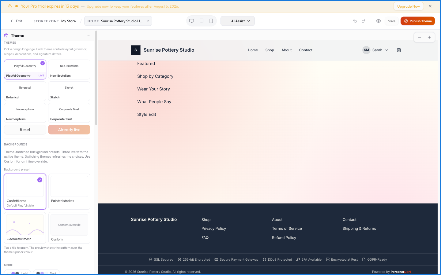
Left rail — the theme. Changes here apply to your whole store, every page at once. Change the primary colour and every button moves with it.
Right rail — the inspector. Changes here apply to the one element you have selected, and nothing else.
If you find yourself making the same change on element after element, you're in the wrong rail — set it once on the left instead.
What it covers
The controls group into tabs — Style, Typography, Layout, Navigation, Branding, Behavior, and Motion. That's a lot of surface, so the full list is catalogued in the theme controls reference:
- Style — theme presets, colors, surfaces, buttons, cards, and decorations.
- Typography — fonts, sizes, and weights.
- Layout — page width, spacing, and structure.
- Components — header, footer, announcement bar, and product-page styling.
What happens — and what doesn't
- Left-rail changes are store-wide — one color choice recolors every page.
- Everything previews live and only publishes when you publish.
- Each storefront has its own theme, so these controls apply to the storefront you're editing.
- Presets are a starting point; every underlying value stays adjustable.
Does a left-rail change affect one page or the whole store?
The whole storefront. The left rail controls store-wide look — colors, fonts, header, footer — so a change ripples across every page.
Where's the full list of theme controls?
In the theme controls reference, split into Style, Typography, Layout, and Components. Each page lists every control and what it changes.